Master Thesis: Nutzerzentriertes Design eines Interface zum Labeling von mehrdimensionalen videobasierten Daten aus Luftbildaufnahmen.
Imagine this: miles of aerial footage, multidimensional data like RGB, infrared, and GPS, all waiting to be labeled and used for AI training. The problem? Existing tools made it feel like trying to solve a Rubik's Cube with one hand—clunky, inefficient, and anything but user-friendly. My goal was clear: design a system that makes data labeling intuitive, efficient, and even enjoyable.
How to approach this Challenge 👩💻
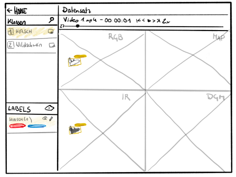
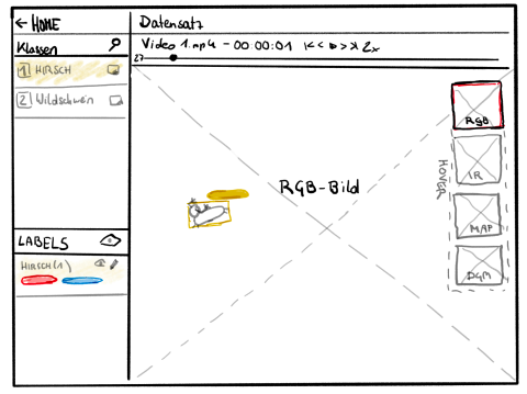
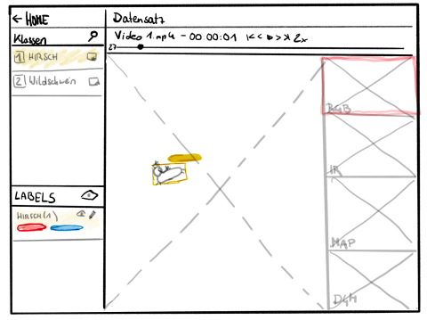
- Concept Development: I created multiple interface prototypes focusing on intuitive data visualization, efficient workflows, and accessible labeling.
- Iterative Prototyping: Using tools like Adobe XD, I designed three versions of a clickable prototype, each exploring different approaches to displaying and labeling data.
- Testing and Refinement: I brought 15 participants into the mix, testing how they interacted with the designs. The goal? Discover what felt natural, efficient, and enjoyable.
The Solution 💡
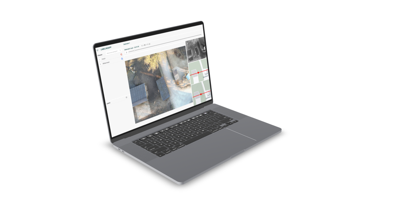
- Dynamic Data Views: A large primary view with preview panels allowed users to compare RGB, infrared, and other data types without unnecessary clicks.
- One-Click Annotation: Users could label objects with minimal effort, cutting down on time and cognitive load.
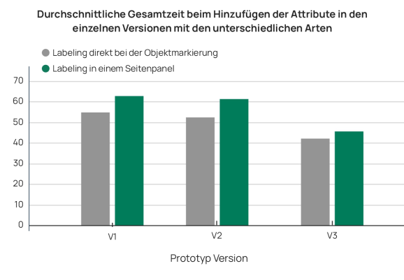
- Overlay Attribute Input: Attributes could be assigned directly on the object, avoiding clunky side panels and keeping the focus on the task.
Data Driven Insides
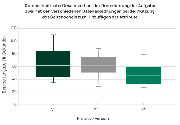
- Users completed tasks significantly faster with the one-click method compared to traditional tools.
- Visualization mattered: the preview-pane layout helped users identify objects more accurately and confidently.
- Overlays for attribute input reduced mouse travel and boosted efficiency, especially in high-density datasets.
What I Learned
Design is as much about testing and analysis as it is about creativity. By combining user feedback with rigorous data analysis, I was able to build a solution that wasn’t just functional—it was transformative. Watching my design empower users to handle complex data with ease was incredibly rewarding.
Why It Matters:
This project was more than just a thesis—it was about creating real-world impact. By improving workflows and reducing frustration, I helped build a tool that can advance fields like biodiversity monitoring and AI training, where accurate, efficient labeling is critical.
Want to dive deeper into the process or chat about how design can turn complexity into simplicity? Let’s connect—I’d love to share more about my work! 😊
